All of the elements but not necessarily in the same order!
Peppadew is an international brand and is much loved in its native South Africa. This particular territory also sees the greatest proliferation of product introductions. The problem was that these new product lines were putting pressure on the existing brand elements to the point of them breaking. The challenge was hold onto established equity but future proof as new demands are made of it.
While the focus was on the master brand there was also the pressing need to look at the label architecture across a range of product lines.
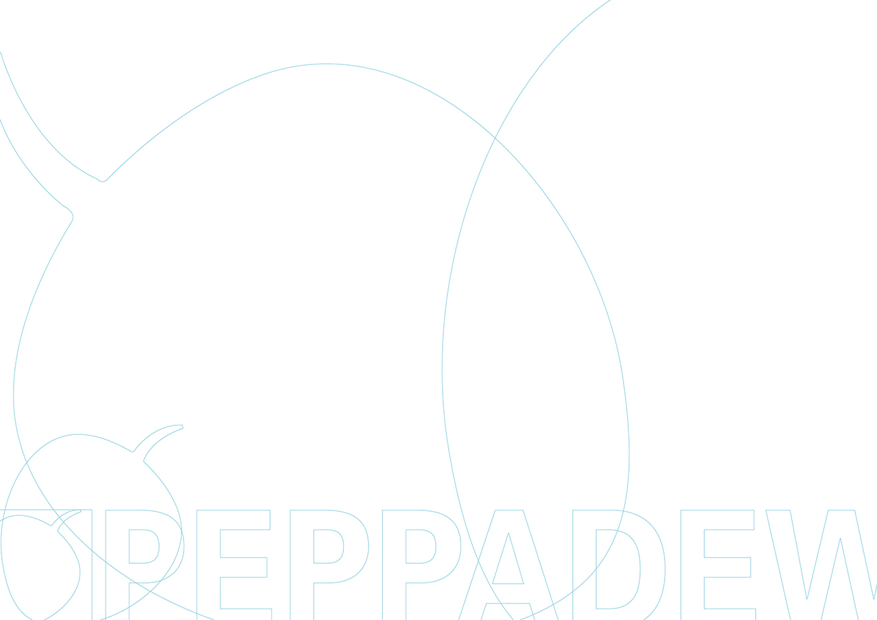
Because of the reticence to dispense with any of the brand elements. The decision was made to celebrate them, make them the star, rather than trying to hide them away. The evolved logotype offers the same elements but uses a far more flexible arrangement – and options. These options ensure fit-for-purpose deployment versus compromise.
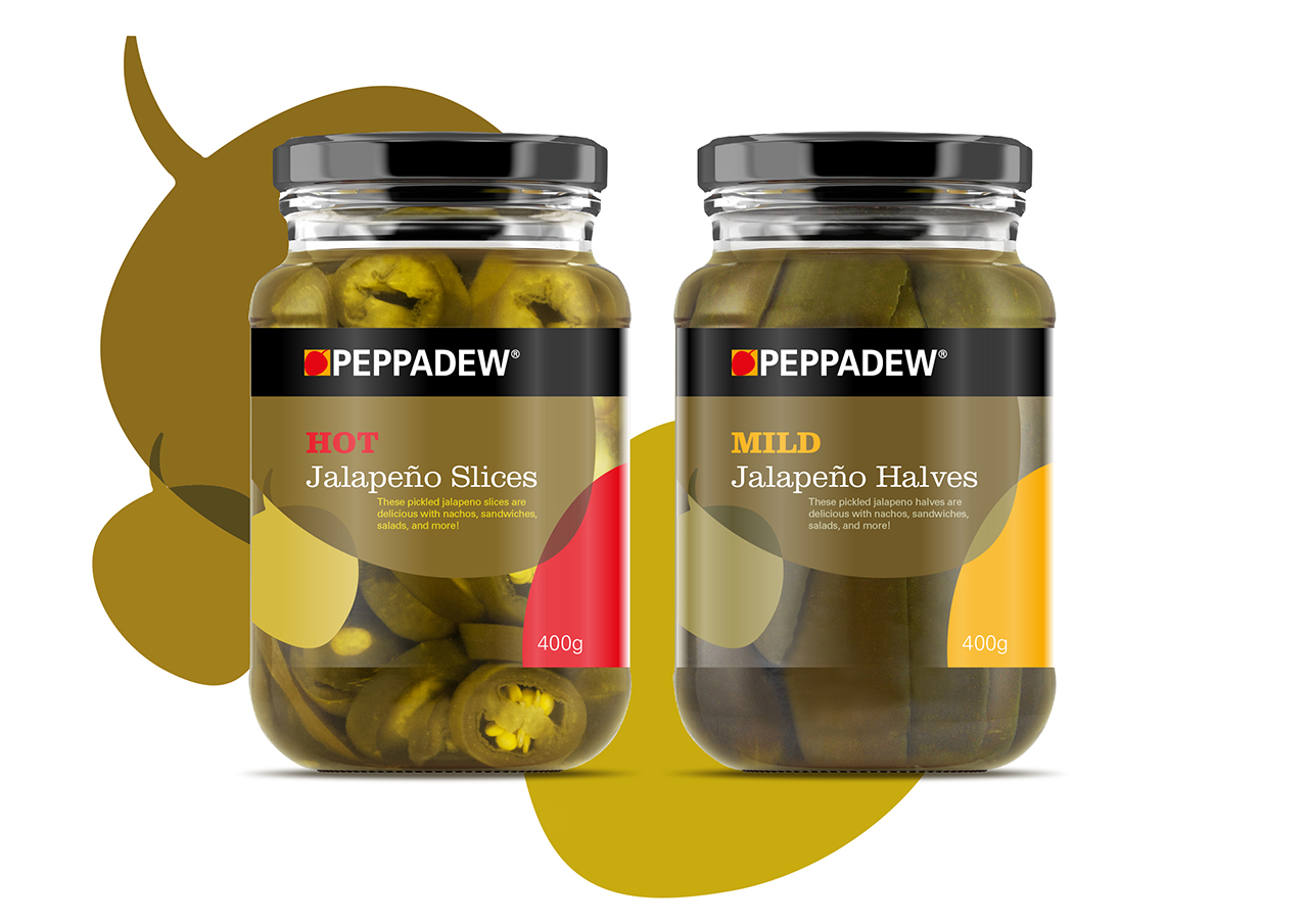
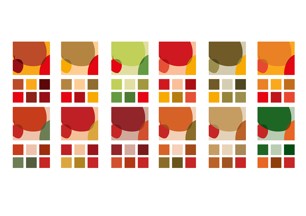
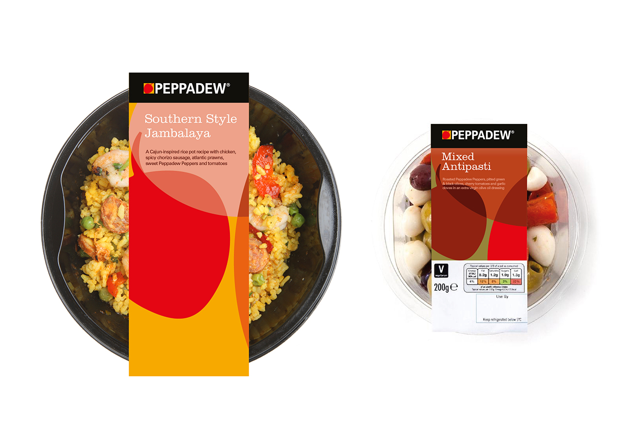
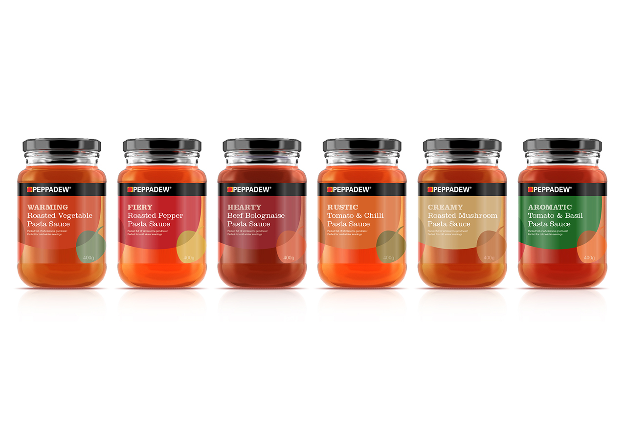
The new label design uses an existing Peppadew component, the pepper, to create patterns and juxtapositions in a variety of ingredient inspired colour ways in order to produce a visually engaging look for the brand.
The intention is to ensure that the packaging is ownable and remains proudly Peppadew. While the brands core colours still feature heavily, a broader palette allows for exciting combinations which complement specific products and enhance their consumer appeal.
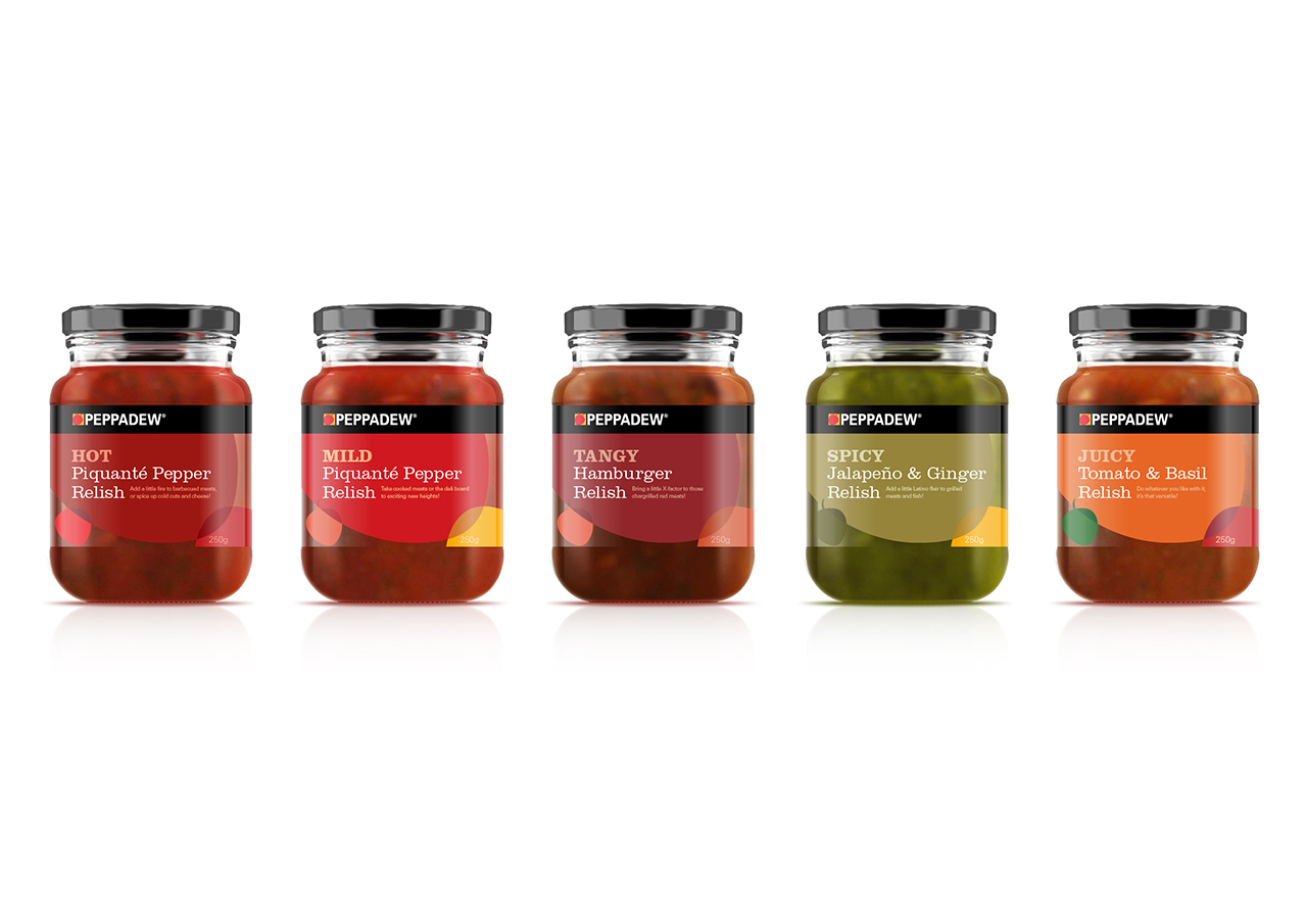
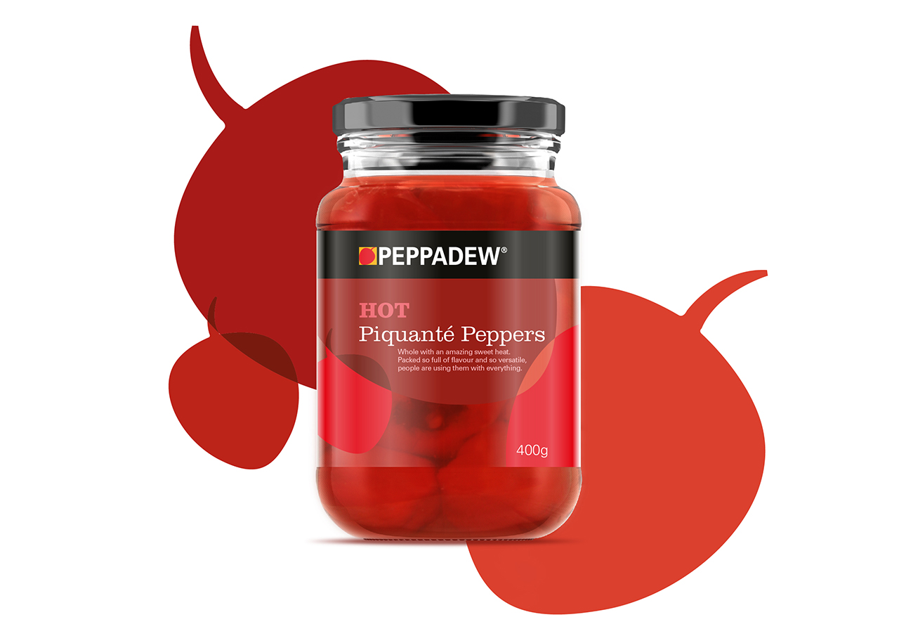
The new packaging takes a much loved element of the logo – makes it the hero, repeats it and overlays it and dials in ingredient specific colours. The approach works across a variety of products and formats – from jars to packets to boxes to tubes.
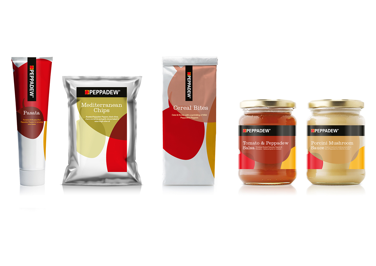
Intersecting geometry, bold colours, simple typography. No brand revolution just the redeployment of existing components that deliver brand consistency in a more efficient and attractive way.