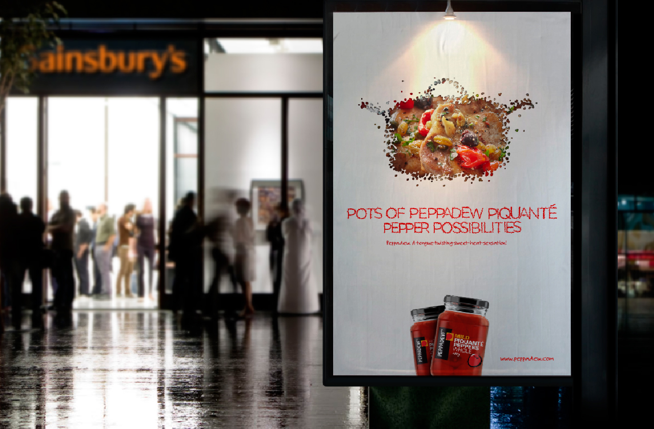
“Peppadew. A-tongue-twisting-sweet-heat-sensation”.
Peppadew Piquanté Peppers – it’s a bit of a mouthful. But rather than being a constraint, it provided the inspiration on which to build a new positioning and creative platform.
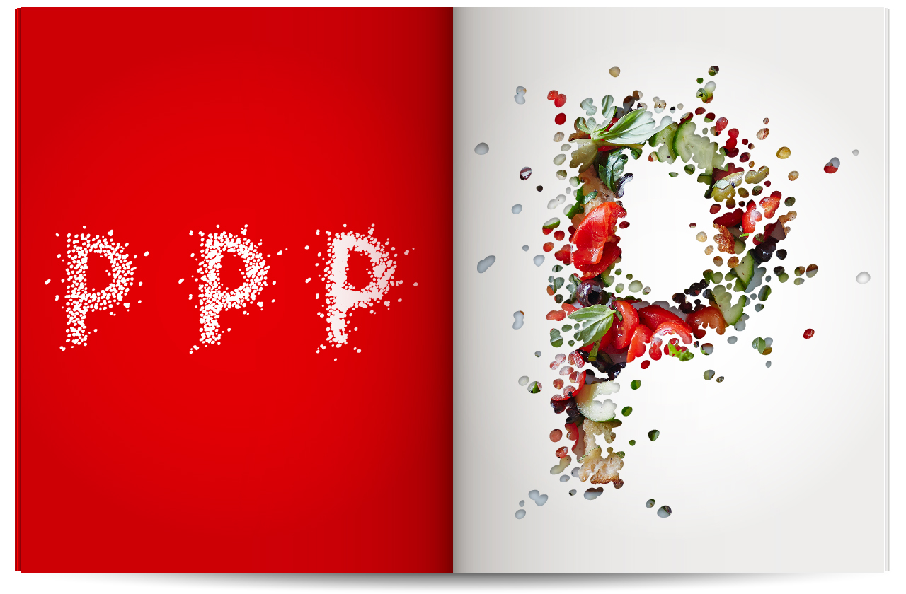
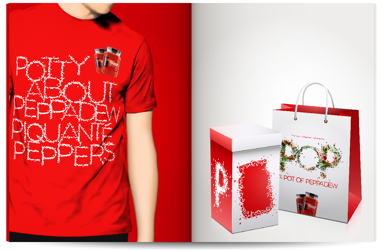
The peppers themselves and alliterations based around the letter P formed the basis for the creative. In fact the letter P was developed into the core element around which the brand could be communicated. Placing the peppers at the heart of the visual approach provided plenty of scope to have fun and develop an array of campaign components.
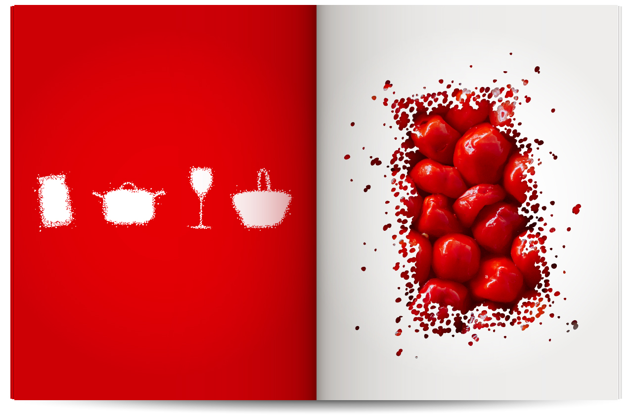
The styling of the core P element provided the foundation to develop the wider Peppadew visual language. A series of pictograms relating to various Peppadew activities, from recipes to occasions, meant that communications could be unmistakably ‘Peppadew’ without overusing the P element.
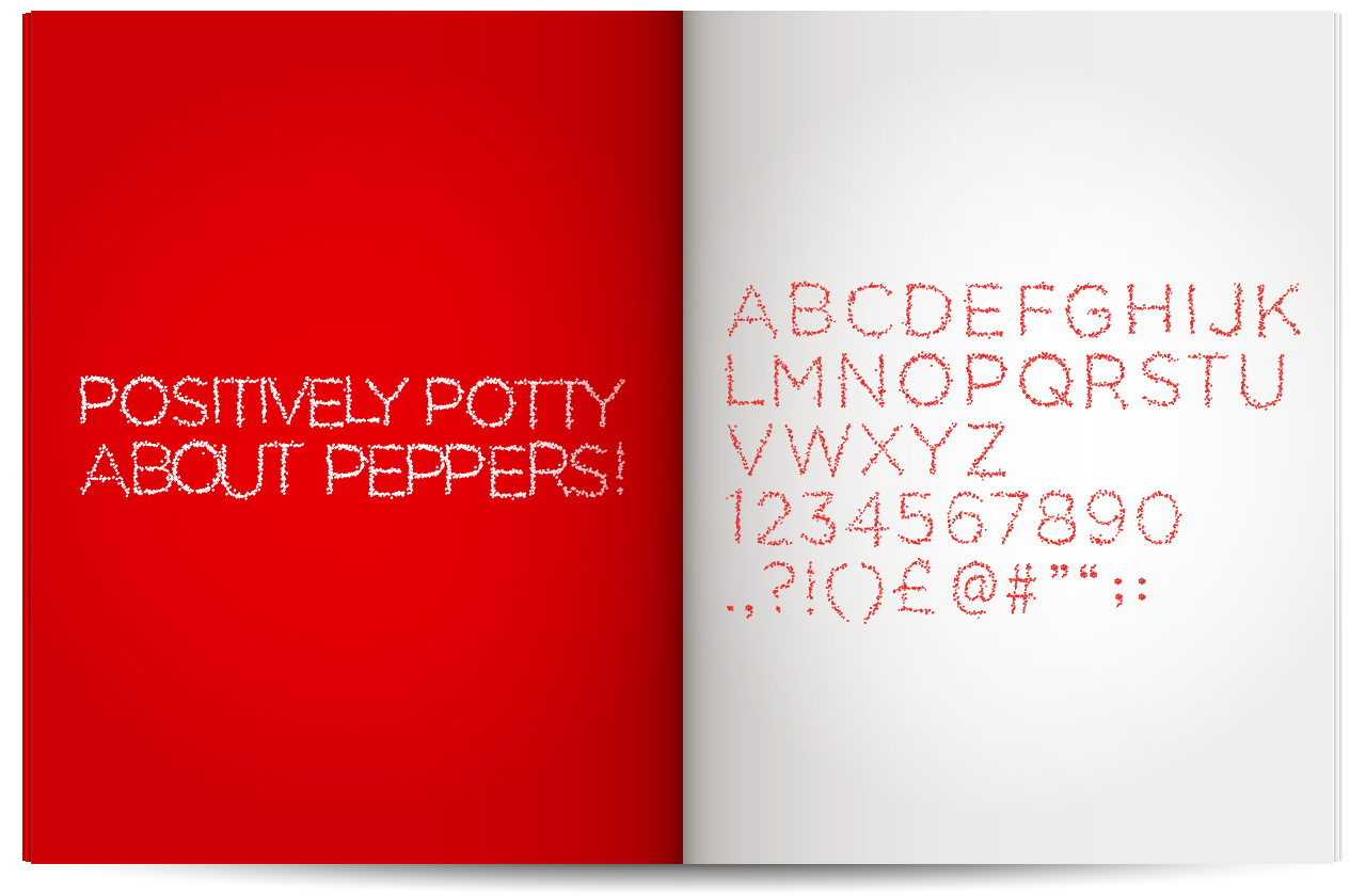
To add further coherence to the brand assets, a bespoke display typeface made up of peppers was also developed.
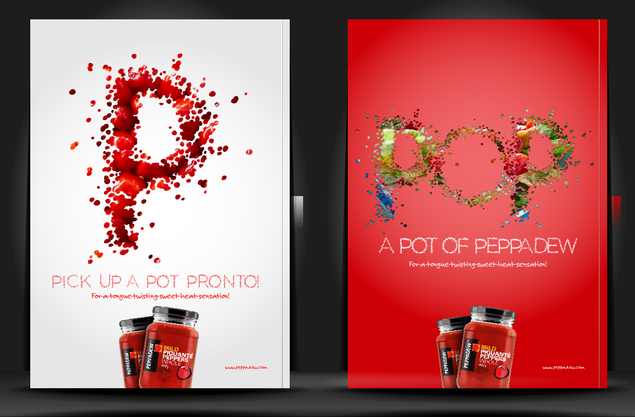
A brand toolkit was developed and various campaign materials including advertising, radio scripts, sampling and POS was also assembled.

In each instance the messaging was built around P based alliterations. This approach provides a tight communications framework but far from being restrictive it offers masses of scope, while ensuring there is always consistency no matter what is being said to whom.
A wide range of materials have been created to talk to both consumers and the trade. From branding up a converted ice-ream van for a sampling tour to preparing product presentations for would be buyers, the whole communications mix is covered.


